We have talked with Oney Architecture about their Euro Food Administration Building project.

Euro Food Administration Building Project
Euro Food Administration Building in Izmir is a complex, which contains several different functions, such as an office, a factory, and a warehouse. We think that the build creates its own, unique form by deaf facades and walls on an unusual scale. How were your design decisions and the building itself shaped in such an area, where the climate is dominated by warm weather?
One of the main inputs for the project was the climate condition. Kemalpasa is situated on a valley between Izmir and Central Aegean. Mountains surround its north, east, and west sides; and the dominant wind direction is southwest. Temperature and precipitation values are similar to Izmir city center.
Surveys carried out during the planning phase showed that the area was negatively affected by the adjacent facility by means of visual and noise; furthermore it weakened the relationship with the rest of the plant. The planned southern facade of the building was exposing to direct sunlight especially in long days of summer, thus reducing the working comfort.
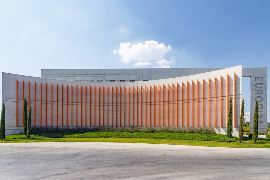
First of all, we wanted to create a cool interior space to the users by the feeling of the building, in addition to its exposed concrete surfaces and material specifications. In order to reduce the effects of sunlight, we also placed the main load-bearing system of the building as curtain walls on the east-west axis. The extended curtain walls to the exterior of the structure also provided the possibility to continue shading for the exterior windows. A second wall layer outside the front West facade was planned, aiming to form a controlled visual relationship with the production area.
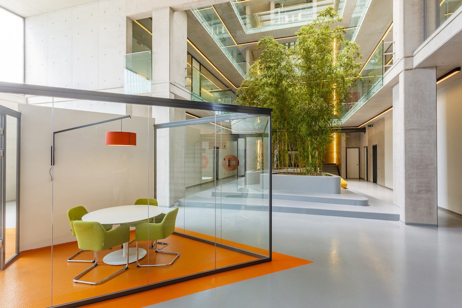
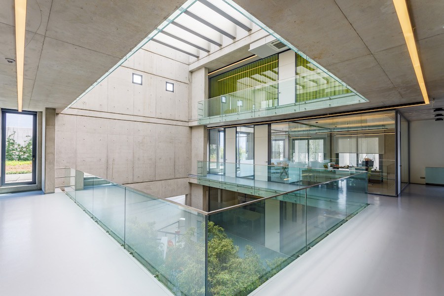
The curved wall located in the south facade and the linear curtain walls located on the second axis creates shading for the building, and additionally becomes baseline of the corporate identity. We have also created an atrium inside the building, aiming for a more introverted building. All the interior volumes merge to the atrium area. The atrium was planned with a transparent roof, and also aimed to maximize the volume of atrium, while beams within the east-west axis for the shading of the interior volume. The light wells can be opened partially and helps to the air circulation.
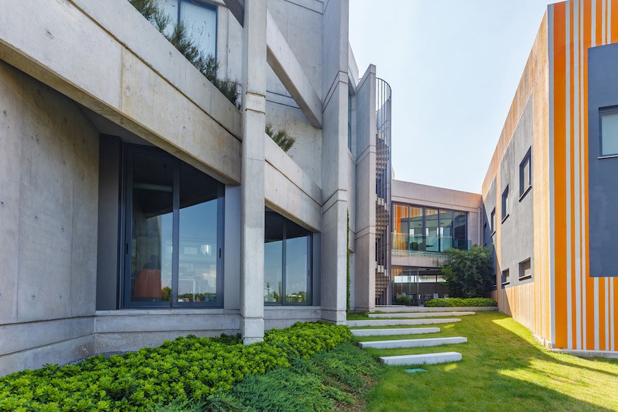
The project increases the spatial use and diversity by defining small exterior areas such as terraces or gardens by the help of major walls and colorful facades. As in the interiors, the project also has social spaces such as the gallery and courtyard. How did you design the user experience in the context of this structural setup?
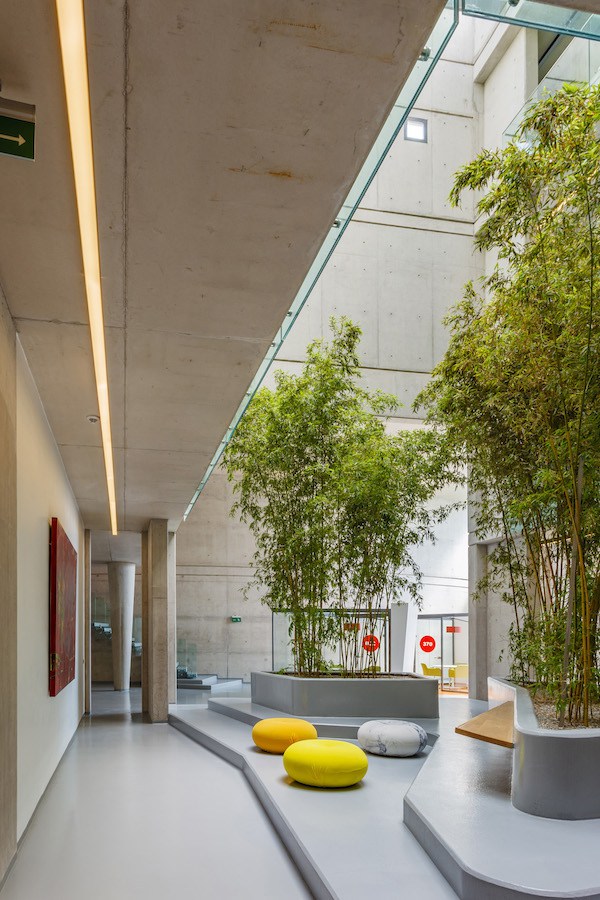
A direct relationship between the administrative staff floor with the factory building and social facility was requested; additionally a space for staff was also requested at the ground floor. Based on these, we decided to create the common spaces such as a meeting room at the basement. According to these decisions, a total of four floors -including one below ground- was designed. The in-between spaces became a courtyard. They are beneath the bridge that links to the social facility was planned as a leisure area for the staff, and that area was also accessible from the kitchen.
The atrium extended through the basement floor was a mediator for the relation between the crowded basement floor and the building itself. We defined the courtyard created in the atrium as both a socializing and a procreative area. The courtyard visible from all the floors aims to isolate users from the industrial area. Staircases situated at the end of the atrium and elevator shaft were designed with a maximum transparency, thus allowing the users to experience the atrium during vertical circulation. In this sense, the general architecture of the Euro Food Administration Building reflects the company’s corporate image, aims for a warm reception for the user, and also creates social spaces.
As a little more general question, the facade design has an impact on the quality of the built environment, besides showing functions of the building or reflecting a corporate identity. In this sense, where do you place the facade design with reference to all the architectural production process?
The facade design of the project should welcome both the visitors and the employees most kindly, apart from the reflection the corporate identity. In addition to the colorful design onto the facade, the landscape design transforms the building into a remarkable element, by differentiating from the existing arid and dry periphery.
There is a constant state of construction in Turkey, especially in Istanbul. Building with various functions emerges and “the identity of the city” is continuously changing with ups and downs. Does the architectural design create an identity within the built environment? Alternatively and without establishing a bold analogy as “an identity”, what kinds of message does a building send?
Both the visual quality and the functionality of a building are equally important. In fact, it might be argued that the ideal outcome is a smart solution of both. As for the site-specificity, the buildings should be designed with respect to the natural or built environment, and also one should consider the expected growing areas in the future.
- Architectural Project: Öney Mimarlık
- Location: Kemalpasa, İzmir, Turkey
- Area: 4400 m2
- Project Year: 2013-2015
- Photos © Ali Kabas Photography
